Exercises
The exercises in this module are about colour, layout, and manipulating graphics - but not necessarily in that order. All students must complete the 'Sprucing up a PDF in Inkscape' exercise, as well as the 'Typography', 'Colour', and 'Layout' exercises. Everything after that is optional (including the option to not do them).
Finally: while we haven't explored the possibilities here, I do not want to leave you thinking that all digital history work is necessarily text based. To that end, if you are looking for a challenge or for exposure to something rather different, I suggest you try my series of tutorials on augmented reality, games, and 3d models for history and archaeology.
Sprucing up a PDF in Inkscape | Typography | Colour | Layout | More
By the way: Raster v Vector
The first thing to know is that graphic images come in two distince flavours - raster, and vector.
Raster images are composed of pixels, such that if you zoom into them, they become a pointilist blur (if you remember Ferris Beuller's Day Off, there's a scene where Cameron stares and stares at a painting, falling into its individual points of colour...). Vector images on the other hand are described by mathematical functions, of lines and arcs and areas. No matter how deep you delve into these kinds of images, the image is always sharp - because the zoom is just another function of the mathematics describing the image.
Rasters: blocks of colours
Vectors: descriptions of points and arcs
Sprucing up a pdf in Inkscape
Some of the tools that we used in Module 4 give visual output as raster images, others as vectors. Sometimes, we would like to tweak these outputs to make them more visually appealling, or clearer, or more useful. A program like MS Paint is only useful for dealing with raster images (and then, only in certain kinds of cases). We need a program that can deal with both, and also, lets us edit the image by treating each edit we do as a mostly-transparent layer on top of the image. That way, we can add, rearrange, hide or reveal, our edits to create a composite image. A free program that is immensely useful in this regard is Inkscape. Inkscape is also quite useful in that we can open a pdf file in it, break the visual elements of the pdf into individual layers, and then rearrange/touch up/fix them up to make them more esthetically appealing.
In this first exercise, we will take the plot we generated in Module 4's exercise on topic modeling in R where we made a bar chart showing the number of articles by year. In R we exported that plot as a PDF. In Inkscape, we can import that pdf and 'explode' it so that we can manipulate its parts individually. We are going to take the simple bar chart and make it more legible, more visually appealing, for incorporation on a webpage.
- Download and install Inkscape nb Mac the installation instructions are a bit more complicated for Mac. Pay attention and follow closely!
- Download the pdf we generated in R publication-year.pdf
- Open that pdf. It's a pretty plain graphic. Right away there are at least two things we could do to make it more visually appealling. We could change the orientation of the characters in the y-axis to make them more legible. We can highlight bars of interest. And we could apply a colour scheme more generally that would make our graphic legible to folks with colour-blindness (see the 'going further' section at bottom).
- Start Inkscape. Click File >> Import >> and then navigate to where you save the 'publication-year.pdf'. Click Ok when you've got it selected. In the next pop-up, just accept the default settings and click 'ok'. Your Inkscape window should now look like this:
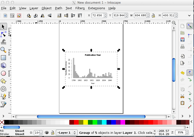
- The pdf is now a layer in the new image you are creating in Inkscape. You can save this drawing, with its information about the layers and what is in each one by clicking File >> Save As. (here's my version). 'SVG' stands for 'scalable vector graphic'. (SVG is a kind of text file that describes the complete geometry of your illustration).
- Do you see the bounding box around the plot? If you grab any of those handles (the double-arrow things), you can make it bigger or smaller on your sheet. We can't edit any of the other elements yet - we can't change the colour of the bars, or the fonts of the text. We have to tell Inkscape to 'explode' these elements into their own 'objects'. In the menu bar at top, got to Object >> Ungroup. There are now a series of overlapping bounding boxes around each object.
- Zoom in (by pressing the + sign on your keyboard) so that you're looking at the numbers of the y-axis. We're going to rotate these by 90 degrees to make them more legible. Select the arrow icon from the toolbar on the left side of the screen.
- Click on the '50'. You'll get a bounding box around it. Click Object >> Rotate 90 CW. The 50 is now rotated! Do the same for the other numbers. Save. (If you double-click on the number, you might trigger the 'text edit' function. If you do that, no problem - you can change the font, change the number... although if you did that, it'd be a bit dishonest, right? Click on the arrow pointer icon in the toolbar again to get out of the text-editing function).
- Let's imagine, for whatever reason, that you wanted to change one of the bars to a different colour, to highlight its importance to your argument. With the arrow icon, click on one of the bars so that you get the bounding box around it. Then, click on one of the colours from the palette at the bottom. Boom! You've got a newly colourized bar. Save.
- Add a legend. Write it so that the important message you want your viewer to get is immediately clear. Choose a font from Inkscape's included fonts that supports your message.
- To export your image so that you can use it in a website or paper, click Edit >> Select All in All Layers. Every element of your image will now have a bounding box around it.
- Go to File >> Export Bitmap. Never mind the options in the popup; just hit 'Export'. Inkscape will automatically assign your drawing a name with .png; here's mine. Remember, if you want to edit this image again later, hit the 'save' button to save it as an svg. The svg will preserve all your layer information, while the png file is the visual representation (the png is in fact a raster graphic). Most browsers can handle svg files, so you could use that in your website; programs like Word seem to be able to handle raster graphics better than they do svg. You might want to experiment. In any event, every journal has different requirements for image formats. You would export your image to whatever those specifications are.
Going further
In this tutorial, you will learn how to load a custom colour palette. Why might you want to do that? You should be designing your work so that it is as universally accessible as possible. Many folks are colour-blind. Use Color-brewer to generate a colour-blind safe palette. Then look for the 'GIMP and Inkscape - GIMP color palette for this scheme.' Click on that link, and you'll get a text file with the scheme you generated. Use that scheme to alter the colours on your plot.
Typography
Typographic plays an important role in visual communication. It can do everything from reduce eyestrain (do a search for 'easiest fonts to read on screen') to communicate power and authority. Is it any wonder that strong bold capitals come to be known as 'Roman'? But first: are you a comic sans criminal?
In this exercise,
I want you to read and understand the section on font choices from the Owl at Purdue.
Then, play some rounds of Typeconnection. Pay attention to why - or why not - various pairings work.
Then, I want to consider the document you will be preparing for me that accounts for your learning in this course - the document where you choose your best exercises from the modules and explain how your approach to history, data, the digital, etc, has changed over this course. What typographic pair would work best for you?
Finally, you'll make a webpage that uses those fonts and explains why they work.
The first part of this exercise then is to find a pair and to understand why they work best for you - go read the materials above, and once you're done with the Typeconnection site, go to Google Fonts and search for a pair that are suitable for your purpose. When you find a font you like, click the 'add to collection' button. Then, at the bottom of the screen, you'll see a link for 'use'. Click on this - google will ask you if you want to use any of the variants of the font. Tick off accordingly. Then, do you see the embed code that google provides, and the code to integrate the font into your CSS (stylesheet)? Leave this window open - we're going to use it in a moment.
- Make a new repository for this exercise. In your repository, click the button beside 'branch'. In the search box that opens, type in
gh-pages. This will create a version of your repository that can be served as a website. - You're now in the gh-pages branch. Click on the + sign beside the repository name. This will create a new file in your gh-branch of your repository. Call it
myfontchoice.html<- the .html is important to specify; otherwise your browser will not know how to render your page. - You now need to put some html in there. I've written a simple webpage that will use two fonts from Google Fonts, and then applies the font to my text depending on whether or not it is a header, which you specify like this:
<h1> this is a header in between header tags </h1>or a paragraph, which you specify like this:<p>blah blah blah a paragraph of text blah blah blah</p>. My webpage is here; right-click the link and open in a new tab. Copy the html into your new html document. Commit your changes (ie, save!). - Let's see what we've got. To see the website version of your gh-pages branch, you go to
<yourusername>.github.io/<reponame>/myfontchoice.html<- ie, the final part of the url is the name of the document in your repo. Do that now. You should see a simple webpage, with two very distinctive fonts. - Now: let's slide your font choices into the html. Go to your html page in your gh-pages repo (ie, not the
github.ioversion, but thegithub.com/<yourusername>/<repo>/myfontchoice.htmlversion. Hit the edit button. Look closely at line 6. Do you see my two fonts? Do you see the pipe character between them? That tells google you want both fonts. Go look at the google fonts page again to grab the exact name for your fonts (ie, uppercase letters make a difference!) and paste them into line 5 appropriately. - Lines 8 and 14 specify which font to use for headers, and which font to use for body text. Change appropriately.
- Change my silly text for a paragraph that explains what the fonts are, and why they work for this purpose. Commit your changes.
- Go to the
github.ioversion of your repository (if you forget the address, you can find it under the 'settings' button on your normal repository page when you're in the gh-pages branch). Reload the page a couple of times to clear the older version you've already looked at and to replace it with your version. Ta da! Not only have you thought carefully about typography and fonts, you've also learned how to serve a webpage from a Github repository.
Hint You could use this as the basics of your submission for assessment, for your exercises. Build a webpage, link to your evidence, embed your images... For basic html here's a really good guide to keep around.
Colour
There's a lot of bumpf out there on the 'pyschology of colour'. Google it to see what I mean (here's an example). A lot of what you see here isn't so much psychology as it is associations (and indeed, western associations, at that). Associations are important of course; you don't want to undermine your message by making some unfortunate connections.
- In this exercise, I want you to take the webpage you developed in the previous exercise, and make two versions of it: one, where the colours support the broader message of the page (a prototype for your exercises assessment piece, remember?), and the other where the colours undermine that broader message. Explain, in both cases, how your colour choices enhance/detract.
alternatively, you can make a one page slide in powerpoint doing the same thing.
Resources
Here's a graphic & a movie to help with the theoretical side of things:

Understanding the rules of color, Lynda.com
To learn how to style your webpage appropriately, you can follow this tutorial on CSS from codeacademy.com.
Colours in Cultures:

Layout
'Layout' can mean different things in different contexts. A general overview on issues in layout is covered by 'What makes design great, Lynda.com and 'Exploring principles of layout and composition'. This slideshare gives you a sense of things to watch out for as well.
For academic posters in particular, consider these suggestions from the APA.
In essence, good layout makes your argument legible, intuitive, and reinforces the rhetorical points you are trying to make. You should take into account 'principles of universal design' - consider these issues with powerpoint and with websites (although some of the technical solutions proposed in those two documents are a bit out of date, the general principles hold!)
In this exercise, you will design a new poster OR modify an existing poster. You can use either Inkscape or Powerpoint.
Inkscape: download one of the scientific poster templates from Ugo Sangiorgi (These are developed from this blog post; note his discussion on design). Open it in Inkscape. Make notes in your open notebook: from the point of view of layout, what elements of the design work? What aren't working? How would you repurpose this poster to fit the requirements of the assessment exercise (remember, details here)?
Here's help with the basics of Inkscape. Modify the poster, and upload the svg or pdf or png version to your repository.PPT: there's a lot of information out there on making posters with powerpoint. Read parts 1,2, and 3 here and then consider the advice here. Once you've read and digested, pick a poster from Pimp my poster that strikes use. Make notes in your open notebook: from the point of view of layout what elements of the design work? What aren't working? How would you repurpose this posert to fit the requirements ot he assessment exercies (remember, details here)?
Grab a template from here, and use it to prototype a poster that works. Upload the poster as a pdf to your repository.
If you want to explore layout in the context of webpage creation, I would point you to the the roster of lessons at Codeacademy. Same instructions: find an existing site that you will consider from the point of view of what works, what doesn't, and use that reflection to guide the construction of your own.
More
More resources, tutorials, and things to explore.
Accessibility and Design
While most of this applies to websites, think also about how the general principles apply to other ways & means of telling our data stories.
- How People with Disabilities Use the Web
- Web Content Accessibility and Mobile Web
- Accessibility in HTML5
- Web Accessibility Evaluation Tool
- Considering the User Perspective
- Constructing a POUR Website Percievable, Operable, Understandable, Robust. Applies much wider than design of websites.
- Checking Microsoft Office-generated documents for accessibility
Infographics / Storytelling
Infographics
- The Difference between Infographics and Visualizations
- Design hints for infographics
- Piktochart
- Infogr.am
- Infoactive.co (has a free option, but might not allow exports. You'd have to check).
- Easel.ly
Storytelling
ManyLines
Manylines is an application that allows you to create narratives from network graphs. In essence, you upload a network file in .gexf format (which you can export from Gephi) and it renders it on the screen. There are some layout options to make the graph more intelligible. Then, you take a series of snapshots zoomed in on the graph in different places, and add text to describe what it is that's important about these networks. The app puts a Prezi-like wrapper around your snapshots, and the whole can then be embedded in a website or be used as a standalone website. Here's my first attempt.
You can also embed nearly anything in the narrative panels - youtube videos, timeline.js, as long as you know how to correctly format an iframe.
To give this a try, why not use the Texan Correspondence network we generated in earlier modules? Export it in .gexf format from gephi, import to ManyLines, and go! The interface is fairly straightforward. Just follow the prompts.
Caveat Utilitor I don't know how long anything made with ManyLines will live on their website. But, knowing what you know about wget and other tools, do you see how you could archive a copy on your own machine? ManyLines is available on github so you can certainly use it locally.
Leaflet
Maps can be created through a variety of services (tilemill, cartodb, mapbox, for instance). These can then be embedded in your webpages or documents. Often, that's enough. But sometimes, you'd like to take control, and keep all the data, all the map, under your own name, in your own webspace. Here is a gentle introduction to using leaflet.js to make, style, and serve your maps. Here is a template for mapping with leaflet, drawing all of your point data and ancillary information from a csv file.
Oh, and here's a list of background maps you can use: http://leaflet-extras.github.io/leaflet-providers/preview/index.html.
Designing Maps with Processing and Illustrator
Nicolas Felton is a renowned designer; this 90 minute workshop is worth watching and working through. Skillshare
Caveat: I do not use processing or illustrator, but processing is free and Inkscape can do many of the things that Illustrator does.